In this Designer Spotlight, Lawrence Chu, Principal Designer, Head of Industrial Design and a master of cultures, tells us how the NIX Lux product line has evolved to become a digital picture frame with an elegant design that gives you the stunning simplicity that you want.
Tell us your story, where do you come from and how did you get here?


Lawrence has traveled across the world to learn the process of making
I consider myself to be from many different places, depending on which period of my life you’d ask about. Although I was born in Hong Kong, and grew up in Kuala Lumpur, San Francisco, Vancouver, Seattle, Toronto, and Shenzhen, I view them all as home. I consider myself a global citizen and my travels have embedded me with a deep cultural empathy between East and West. I spent the last decade in Shenzhen and Hong Kong.
Being at the heart of the world’s hubs for manufacturing and innovation, I came to be exposed to the incredible processes of ‘making’. This is where things are being made on a global scale. The projects that I encountered in Asia have been wide ranging from corporate to independent businesses in various product categories such as utility housewares, sporting apparel, electrical appliances, consumer electronics, fashion jewelry, high-end audio to automotive and pet goods. Asia is an exciting place for design.
Tell us in one sentence what NIX Lux means to you.
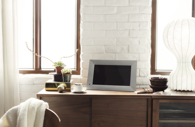
NIX Lux is a beautiful, premium, and affordable digital photo frame designed for that person who cares about their home décor and is looking for an effortless way to showcase the photos that have been stuck in an SD or USB memory device that are often left forgotten about in some drawer.

Nix Lux Silver 13″ fits your home decor
How is the NIX Lux different from the other NIX products and other non-connected frames in the market? What were your design objectives when you came up with the NIX Lux?
If you look at the current NIX range, it looks quite generic by today’s standards. This wasn’t always the case. Nearly a decade ago, there weren’t many fast adopters in the industry and NIX was a pioneering business leading in quality, customer services, and technology in non-connected digital photo frames, both in the U.S. and around the world. We were the first to implement Hu-Motion™ sensor technology to reduce the energy use of the digital photo frames.
Fast forward to today and the entire category is flooded with frames that look like our NIX range. This generic range of frames are mostly all black, made of plastic, and do not visually fit in with the home and living environment.
NIX Lux was on a mission to redefine what a digital photo frame can be for the everyday home, particularly to those that do care about their home décor and interior design. We wanted to migrate some of the aesthetic excellence we know that our loyal customers loved from our industry defining models such as Nixplay Seed and Iris. The visual brand language is defined by having a sculptural back to the frame which is carried over from the Nixplay Seed and Iris WiFi connected frame range. From the front of the frame, it’s very premium, made with a unique technology that wasn’t widely available in the NIX Advance era. The wooden touch seen on the NIX Lux is made with real wood veneer, and the technology fuses plastic and wood seamlessly allowing for a luxury aesthetic. There’s little comparison to anything available on the market at present.
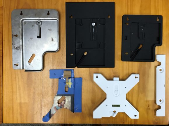
Functionally, NIX Lux comes with a host of unique design features that makes it more user friendly. It offers adjustable viewing angles which was previously not available in the NIX series. The entire NIX Lux range can also be wall-mountable with an added accessory. There is an auto-rotation feature supported by a gravity sensor, which lets our customers view their photos in both horizontal and vertical mode by simply rotating the frame 90 degrees. Compared with other non-connected devices in the market, majority of these devices are overly simplified and reduced to the bare minimum cost production and feature-wise. These frames do not pay attention to the user experience from either a visual or interactive perspective. I think that some of these features makes the NIX Lux unique from the rest of the market.
NIX Lux is an interesting name, how did you come up with it?
Yes, I can’t take credit for the name ‘Lux’. We actually brainstormed and came up with a stack of names. We looked at what was happening in the consumer electronics market and logic behind the naming conventions of various brands and none of them worked for us.
Peter O’Kelly, our General Manager, was the primary generator for the word ‘Lux’ for this digital frame range. It took some time, but it gradually resonated within the organization and we just went with it. I think it works because we are looking to provide an elevated level of luxury to this new NIX product range, and now there’s a name to go with it.
Describe your creative process with regard to NIX Lux and what makes your approach unique?
The approach to design is quite standardized, no special magic there. We began the design through the process of empathy – attempting to understand our customer’s needs – versus what technology and our business can provide. We practice ‘design thinking’ in Nixplay, which begins with understanding and observations. We conducted a lot of research with our existing audience to make sure that we were creating things that they were expecting of us. By listening to them, we were also able to define the opportunity gap and learnt what our new potential customers would be looking for. Some of those things were decorative elements, improved usability, better display quality, and a new standard of craftsmanship in our products. Through painful, but necessary iterations of discussions and questions, we eventually defined what the product should be. Then we endlessly ideated and prototyped to ensure that there was a balance between what the technology could deliver, what our business stakeholders were aligned to, whether the solution was aligned with our customers’ needs and wants. These attributes come together to create an overall higher quality and standard of product.

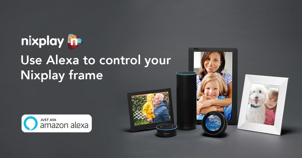
Nix and Nixplay products are built through the process of ‘design thinking’
What part did consumer feedback play in your design process? What was the most difficult part of the product design process for NIX Lux?
Consumers have a huge voice in the design process; the other being that of the business stakeholders, our investors. The design comes in as the mediator between these voices. Between the design group at Nixplay, we try to keep a balance between these key players and what they are looking for in the evolution of our brand as we execute designs.
That is easily the hardest part of my job. When I first joined the organization, there were a lot of things that I needed to learn in order to come to an understanding for what was needed of me. I also had to discover a method to understand our users through different immersive design research tools. There were lots of empathy activities that needed to be documented and shared before alignment could be achieved.
What do you use your NIX frame for?
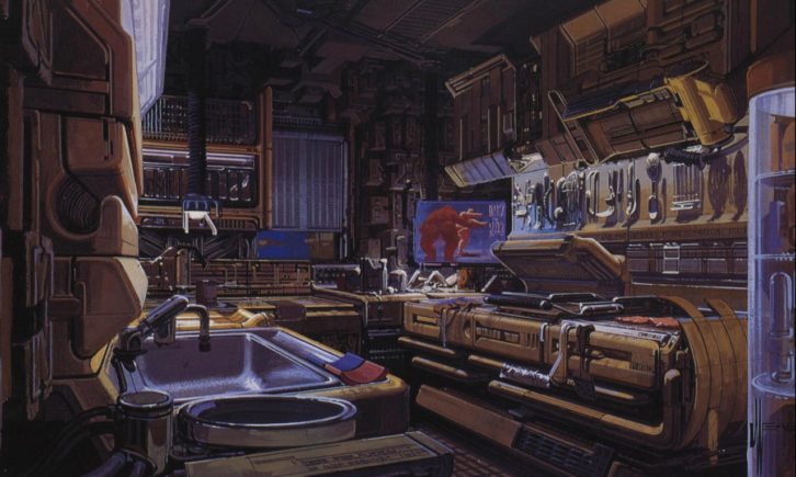
At the moment, I use the 13” Wood NIX Lux frame to display art works as I am into retro sci-fi futuristic illustrations. There are several artists that I enjoy seeing the works of such as Syd Mead (Bladerunner), Daniel Simon (Tron), and Scott Robertson (Minority Report). It’s the nerd designer in me speaking now, but I believe that everyone would have different preferences on what type of content they want to use their displays for. Some people like to use it for portraits of family and friends, which I also do. Overall, I think that the NIX Lux is a beautiful digital photo display that would look good in any living room, regardless of what you showcase.

Nix and Nixplay products can also display artworks


